Akshita's Blogs | CSS Tips For Beginners
Things I wish I knew when I started CSS
The best resources for CSS I’d recommend are CSS Tricks and MDN docs. Remember, Web3Schools is not a reliable resource. Also, refer to html-css-js.com/css to experiment.
-
CSS Variables or (Custom Properties)
Bigger your website, larger the CSS file and more the repetition of values such as colours. To make it easier to modify these in all places at once, we can use CSS variables. These are set using custom notations such as -and accessed using var() which replaces the reference with the value of the variable:root{ --primary-color:red; --background -color:black; }Another benefit of using variables is that they are more meaningful, that is semantic. Naturally, since understanding and writing --background-color instead of #000000 is easier because we don’t have to keep track of cumbersome hex codes or RGB values.body{ background-color:var(--background-color); color:var(--primary-color); } -
Selectors
Selectors decide to what a set of CSS rules applies.
Such as
- Tag selector
                                    p{
                                        margin: 2px;
                                        padding: 1rem;
                                    }
where p is the HTML tag for paragraph
- Class Selector
                                        .className{
                                            margin: 2px;
                                            padding: 1rem;
                                        }
where a set of elements contain class=”className” as attribute
-
ID Selector
                                        #idName{
                                            margin: 2px;
                                            padding: 1rem;
                                        }
where a single element contains id=”idName” as attribute
IDs are unique but classes are not. So, there only be one element which has a particular ID but some similar elements which have to be styled the same way may have the same class. Selectors can also be combined such as div,p means all divs and paragraphs but div p means all paragraphs inside divs.
- Content: content consists of text and images
- Padding: is the space around this content
- Border: border goes around the content and the padding
- Margin: margin is the space around the border
- Tag selector
-
The CSS Box Model
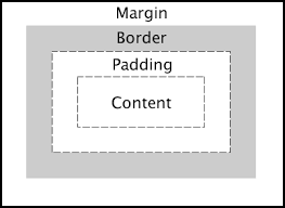
All HTML elements can be considered as boxes or conversely, we can say that all HTML elements have boxes around them. Understanding these boxes helps us in understanding the layout. It is impossible to align items without having a good understanding of The Box Model and CSS units.
Now, there are two kinds of boxes, inline and block. There are two major differences between the two.
First, block elements start from a new line, inline elements don’t.
Secondly, height and width properties can be applied to block elements but not to inline elements.
div, p and h1 tags are block elements but span, em and strong tags are inline by default.
-
Flexbox
The easiest way resize the items on a screen dynamically is using flexbox. The idea behind it is to be able to use the space in the best possible way by doing minimum work. To enable flexbox, the parent element with class container and say three elements
                                .container{
                                    display:flex;
                                }
This enables the direct children of the parent containers to aligned using flex. To stack the items on top of each other in a column we can apply, flex-direction: column to the container, for the items to be placed in a row we can apply, flex-direction: row to the container.
There are several other properties that can be used here to render the item in any way possible. One such way to align the items in the center is by adding to the container,
                                .container{
                                    display:flex;
                                    flex-direction:row;
                                    justify-content:center;
                                    align-item:center;
                                }
For a more detailed explanation, please visit css-tricks.com/snippets/css/a-guide-to-flexbox.
-
CSS Grid
A grid divides the page into regions. The parent element is defined as a grid so that its items can be arranged using grid layout.
                                .container {
                                    display: grid | inline-grid;
                                  }
Then, the layout of each item can be defined using
                                .one{
                                    grid-column: 1 / 3;
                                    grid-row: 1;
                              }
A responsive grid generally has 12 columns.
-
Media queries
Sometimes, we might want to change our layout depending upon the device being used or certain specifics such as its screen resolution or viewport, that’s where media queries come in. This comes in handy when we take the mobile-first approach as recommended. To change the background to light blue on a screen of width 600px or smaller, we use this:
@media only screen and (max-width: 600px) { body { background-color: lightblue; } } -
CSS Units
It is also very helpful to know the different CSS units because a lot of the properties of CSS are defined using these such as margin, padding, border and so on. Some commonly used CSS units are
- em : Calculate relative to the parent element’s font-size. For example, 2em means 2 times larger than the parent’s font-size
- rem : Calculated relative to the root element’s font-size. For example, 2 rem means 2 times larger than the root element’s font-size.
- px : 1 px is one pixel, this too varies according to the screen resolution of the viewing device.
- % : percentage value is relative to an element too. For example, 25% of the width of the container.
I personally find it useful to use px for small spaces but for the size of larger items its more sensible to use rem, % or em.There are other CSS units besides these, however these are the most common ones.
-
Clearfix
Clearfix is used to clear floats. Now, what does that mean?
When an element is floating and is taller than the element containing it, it overflows.
Clearfix is a way to handle this.
Essentially, clearfix is :
                                .clearfix {
                                    overflow: auto;
                                  }
Clearfix can be applied to any element using
                                .parent:after {
                                    content: "";
                                    display: table;
                                            clear: both;
                              }
This uses the concept of pseudo elements, but I won’t confuse with that. Nevertheless, here is a reference for it. css-tricks.com/snippets/css/clear-fix/
-
margin:auto
Often, I’ve had trouble aligning items in the center of the container. There is actually a very easy way to do it. We can simply add margin:auto; to the element. By using that, the browser calculates the margins and in certain cases this can be used to horizontally center the elements.
-
Component Library
Another thing I learnt, is it is much easier and quicker to design a website after creating a component library for its elements. This allows for a more structured and ordered way to design a website and avoid confusion.
Free resources I use:
- For icons : Flaticons
- For images : Unsplash
- For colour palettes : Coolors
- For illustrations : undraw.co
- For fonts : Google Fonts
Extra tip : Also make a habit of using developer’s tool available in browsers itself. They can be very useful while working with CSS.
Inspect the elements using Ctrl + Shift + I on google chrome.
Lastly, comments are extremely useful when you want to review, add or modify anything. So, keep in mind that the CSS file is well structured and code is written neatly with comments added to explain different sections such as typography, containers, lists, links as so on.
Adios!